
For some reason, Topps continues to play the Wal-Mart vs. Target game this year by having red and blue border parallels of the base cards. I don't get it at all.
Sure, the red looks great for the Reds, Cardinals, Red Sox, and a handful of other teams. And maybe the blue looks good for the Royals, Dodgers, Blue Jays and a few other bad teams. But what about the Orioles, Tigers, Rays, White Sox, Pirates, Rockies, Padres, Giants, Mariners, and A's who have no connection whatsoever to those colors. It just doesn't make sense. I've asked this a few hundred times before, but have to ask again:
How F'ing hard is it to create a "Team Color" parallel? Take the team's primary color, and that is the parallel. Then, if you want to get...gasp...gamechanging...have a retail-only secondary color parallel numbered to the year.
How badass would it be to have base, primary, and secondary trios in 9 pocket pages for your team. The numbering on the secondary makes them slightly rarer, but still obtainable. Imagine blue borders for the Mets, with short printed orange borders. And Topps, they don't have to be those shimmery borders. They can be flat, that's ok. Just make them make sense.
Anyway, I got 3 of the red border cards. Let's see if they make sense.
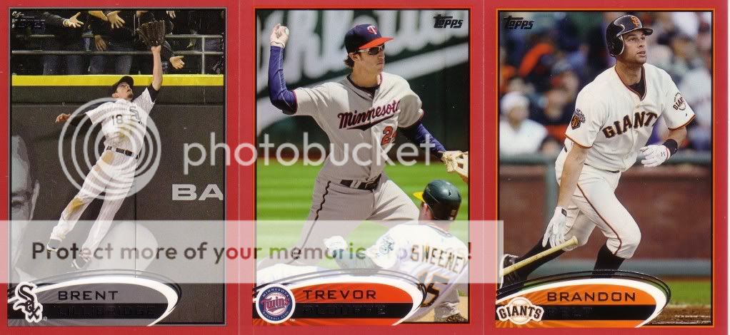
...and I'm not even a team collector.


Don't worry, this isn't the only "WTF, Topps?" moment. There will surely be more to come as we progress through this fortnight.
4 comments:
Well Toys R Us has a purple parallel this year for us Rockies fans and to annoy every other team collector. So yet another parallel to collect.
Actually, I gotta disagree with you on this one, the only team I've seen that that blue border works for so far is the Mariners, it's way to light to be of any use on a true blue oriented team.
The red does look awesome on the Phils, and the right shade of blue would look equally great, but the shitty blue that Wally world got shafted with just does not work, and it looks too close to the "blue" parallels from the Opening Day set as well.
I could really get behind team colored borders though, that's a real "gamechanger" right there!!
i just love seeing the repeated use of the word "fortnight"
any chance that Belt is for trade? If so, drop me a line.
I really like the idea of the team color themed inserts, the giants look great in orange.
Post a Comment