

I am a weak person, so I splurged on a blaster.
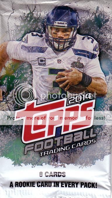

Blaster packs should be the same as retail packs...none of this 8-card baloney. A rookie card in every pack? Well, at least one pack had a Johnny Brownsbackup.
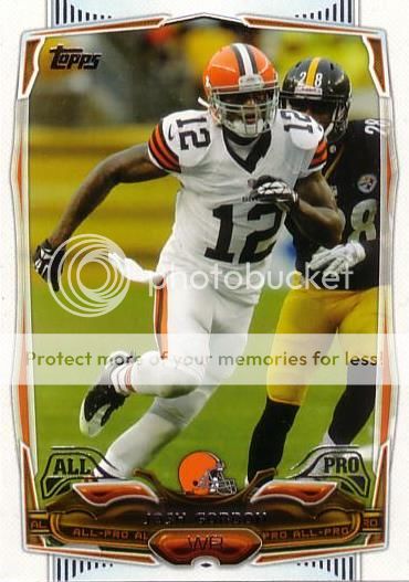
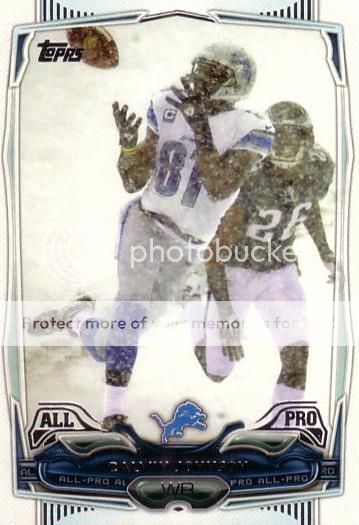
Two All-Pro WR, two very different season projections. Josh Gordon is an absolute moron. Calvin Johnson is a stud, and the anchor to my fantasy team this season. His card is brilliant as well.


The foil on these cards is awful as usual. Completely unnecessary. The Player of the Year foil is really cheesy looking. Just look at the name on the Claiborne...no foil, great look. Of course, it is a Power Players card which means I don't know what it means.

Team cards pretty much always look good.
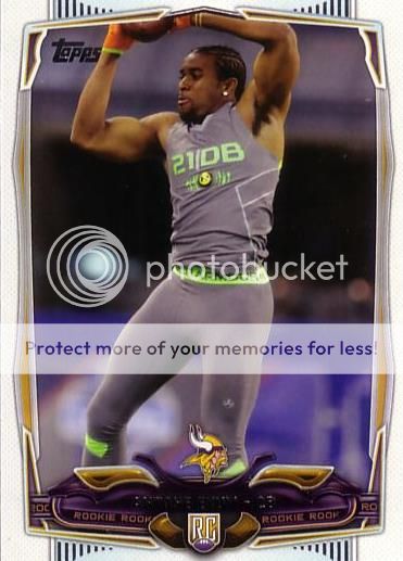
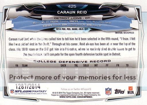
Antone Exum is a former Hokie. Not usually a good thing when there is a hint of jank on your card.

Gold guy next to plain guy. Not bad. Not good.
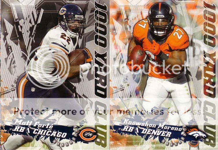
Topps 1000 Yard Club insert brought to you by Score a couple years ago.

Better design, but give the man his due...Peyton is in the "threw for more yards than anyone ever" club.
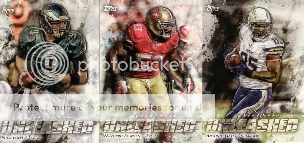
Do we really need this insert? I'd rather see "Pretty Goodness Unleashed" featuring average players that don't usually get inserts.

Not bad...until you flip them over. The back sucks. I didn't even want to show it to you. It's a complete missed opportunity.
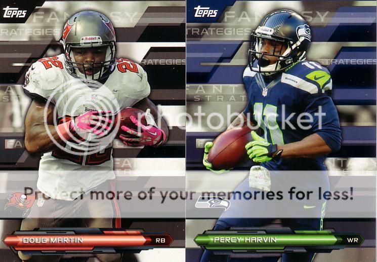
Reading left-to-right, top-to-bottom, these are FAN SY RATEGIES RATEGIES A STR A G FANTASY TRATEGIE inserts. How they differ from Fantasy Focus? The fronts of these suck in addition to the backs.

Standard not-the-same-size insert card. It's not a good decision to reprint a bad decision.
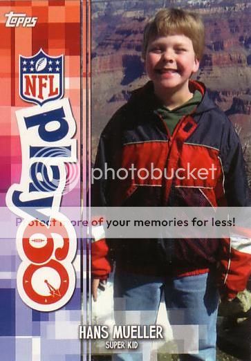
No no no...this is not...no..just...no...this is not how cards are supposed to be for kids. I really want this card to un-exist. How does this happen? Don't do this to this poor kid. He deserves so much better. No kid should be on a card that almost everybody is going to want to throw away.

Here is my heavy coin card. The front of the coin is somehow miscut. Fortunately, the back is A-ok.

So, if I understand this correctly, this is a coin that commemorates 2014 Topps Football. It commemorates that momentous event known as this year's standard football release. It commemorates itself. Seriously, Topps, WTF? The Bengals B on the front looks great (aside from being off-center) but the back is dumb. At least put something team or player related on there. If you're making these, just get rid of the damn player card and have the coin free floating in a pack. It's not a commemorative coin. It's a coin. It's a team coin...and that's ok. Let it be, Topps, let it be.
1 comment:
Topps deserves to lose its football license after this base card design. Ugly as hell. It's Bowman football.
Of course, Panini isn't exactly a design whiz.
Post a Comment