

How dare I question Heritage? Oh, I dare. People love Heritage. It's pretty sad, actually. Heritage should be an insert set for Topps Flagship, and that's it. The fact that Topps releases both Archives and Heritage is just embarrassing. Heritage is easily one of the worst licensed baseball products of every year. The key word is "licensed". It still has logos, so it still has some positive aspects.
Donruss is a name we all recognize, which is precisely what Panini relies on. Unfortunately, Panini has to operate without a license, making their products subpar straight from the drawing board. However, there has to be a point where laziness (Heritage) and inability (Donruss) cross paths.
To further analyze this problem, I've opened three packs of each product and picked the Top 7 cards for each one. Then, I went down the line comparing 7-7, 6-6, etc.
Here they are:
7)

Wieters isn't exactly a Topps kind of guy, so it's appropriate to start with him. The Donruss design is decent but not great. If you threw a team logo instead of "Baltimore" in there and shrunk the border a little, you would have a great-looking, very Donrussy card. I'm giving the win here to Donruss because catchers still look pretty good on unlicensed cards. The Angels Rookie Stars card is only decent because the design is decent. The player images suck. Donruss 1, Heritage 0.
6)
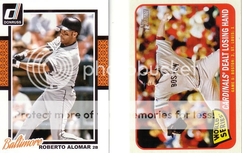
This is a tough one. First off, the Heritage card shows a Red Sox pitcher, but is captioned form the Cardinals' perspective. Also, "dealt losing hand" just doesn't quite work. It makes it sound like it was all bad luck. However, the blank helmet on the Alomar is unforgivable. Donruss 1, Heritage 1.
5)
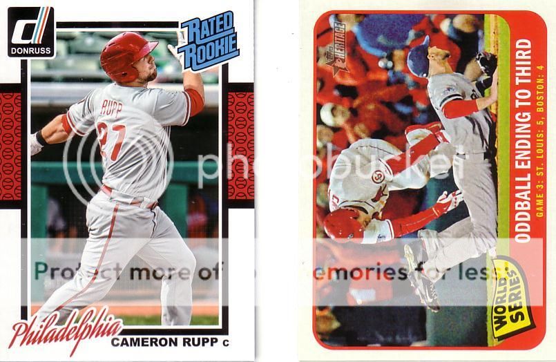
After three Donruss cards, you should be noticing the close-cropped photos that reduce photoshop time. Hooray for the Rated Rookie logo, but the rest of the card is weak. Donruss 1, Heritage 2.
4)
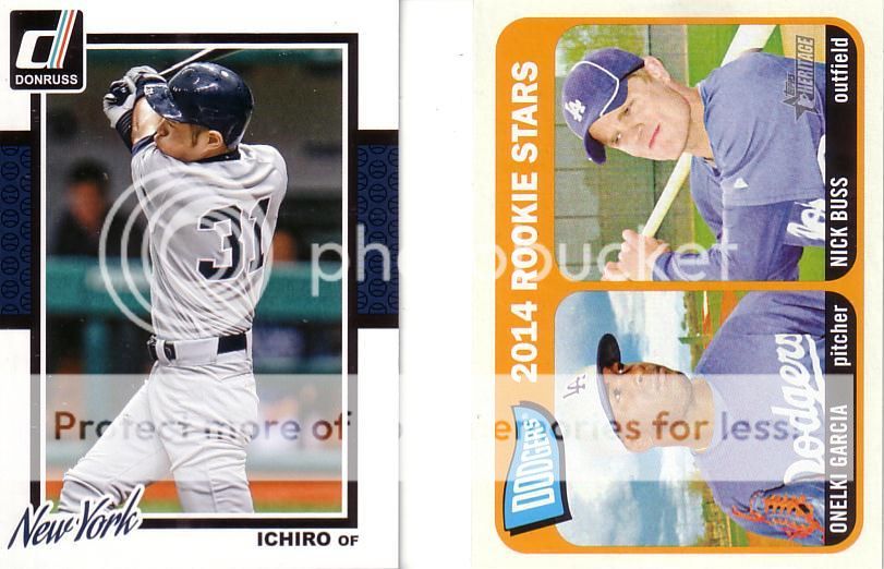
More of the same from Donruss, but they at least know how to design a card so that Ichiro's name doesn't look terrible Easy win for the Dodgers, though, because white Dodgers hats are awesome. Donruss 1, Heritage 3.
3)

A double dose of Max Scherzer, but I have to give the win to Donruss. I'm sure you won't agree, but the 3-player Heritage cards just aren't that attractive. They should either float the heads or just give the card to the top guy. Pitchers have the best jersey-back photos, so using them in an unlicensed product is smart. Donruss 2, Heritage 3.
2)
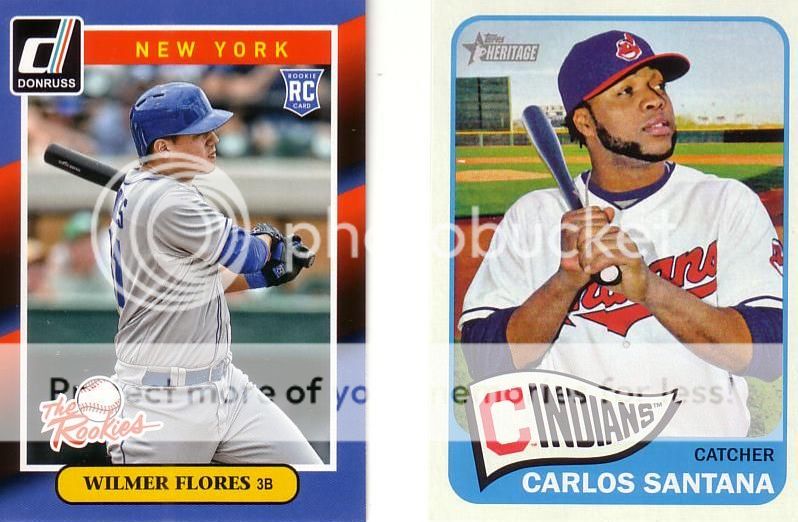
Santana is a short print. It's a pretty nice looking card. Sorry, Heritage fans, Flores wins this one and it's not even close. That is a beautiful retro-INSPIRED card. It's not a retro-EXACT card. Donruss 3, Heritage 3.
1)

I have to give credit where credit is due. Topps used some creativity in the Flashbacks set. They weren't a part of the 1965 set. So, Topps had to invent them. Topps, however, made one crucial, crucial mistake. They used 1965 events for the Flashback cards. Everyone knows that 1965 Topps cards have stats through 1964 on the back. So, for accuracy's sake, they should have used 1964 events to be featured on a 1965 design. Koufax is great, but this card reeks of making something new out of a bunch of not new things.
That said, the Harvey card also bothers the crap out of me. His ERA was 2.27, so the card is numbered to 227. 2.27 does not equal 227. It's not even a batting average where you can sort of equate .325 with 325. Turrible. The placement of the 2.27... part is pretty weird, too.
So, my final verdict is to split the final point giving a final score of
Donruss 3.5, Heritage 3.5, The Dump I Took This Morning 4.
Dump wins.
No comments:
Post a Comment