
I've been wondering. How does Topps choose a color for a parallel? Gold kinda makes sense as a premium card. Platinum makes sense to one-up the Gold. Black makes sense because black is edgy. Green, Blue, Red, Orange, Purple? I got nothing. This year's common parallel is green...I mean emerald since it's shiny.
 |
| Granderson, Wilson, Pedroia |
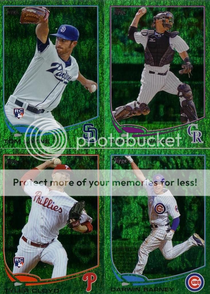 |
| Layne, Hernandez, Cloyd, Barney |
Every time I see one of these, I think to myself, "wow, those are cool...but...why the f are they green? It looks terrible with the team color designs."
I know it would be a burden on Topps, but they could seriously improve the parallel market by having two different parallels: Team Color 1 and Team Color 2. Maybe the second color is rarer. Maybe one is matte and one is shiny like the emeralds. Sure it means Topps can't just produce sheets of one color for all cards in the set. But, it would make it seem like Topps actually gives a crap about collectors.
I just want a set to come out where it looks like a group sat down in a conference room and looked at each type of card and asked, "What is the point of this card?"
3 comments:
Green is my least favorite of all the refractor colors that Topps puts out and these parallels make me dislike them even more.
Got plans for that green Pedroia?
Any interest in a trade for the Barney?
Post a Comment