Thursday, February 28, 2013

Shoebox Card #3

1989 Topps Cap'n Crunch #9

If this card is made by Topps, why did it have to be airbrushed? Man, I wish you could still get cards in Cap'N Crunch.  Of course, I'd then have to stop buying the cheapo Kroger-brand Crisp Berry Crunch.

2006 Topps Allen & Ginter #130


That picture is mesmerizing for some reason.  It's a great shot, but looks a little like his head was photoshopped in.


Wednesday, February 27, 2013

Shoebox Card #2

1992 Upper Deck #633

It's really tough having to pitch every fifth game.  I wonder what those guys do for the other four games...


Weird-Oh Wednesday #17a


There's just no place in the NFL for guys like this anymore.  Sad.


Tuesday, February 26, 2013

Shoebox Card #1

1992 Mother's Nolan Ryan 7 No-Hitters #5

Nolan Ryan will show up on this series more than any other player, so who better to start with?  Of course, I may have blown my wad too soon as this is probably the coolest of all the Ryans.  Every aspect of this card is awesome. 

2006 Topps Allen & Ginter #129


Paul Teutul Jr. made Aaron Rowand a bike.  It's cool, but it's no Yankees bike.


Monday, February 25, 2013

Two shoeboxes of junk... I love it!

My brother recently informed me that his friend had a couple of shoeboxes of cards from his childhood that he was looking to part with.  He said he would give them to me for the low, low cost of free. 


He didn't mention that he would include the crazy cool and impractical baseball shaped card case.  Based on his age, I figured most of the cards would be from the late '80s and early '90s.  I was correct.


I finally gone through all of them, and I've picked out around 100 notable cards to show on here over the next few months.  Of course, "notable" can mean a great many things. I thought about doing a countdown of the 100 best cards, but that would be too much work and wouldn't really capture the essence of the boxes.

Going through these boxes was a ton of fun.  It was great seeing all these cards I remember from my childhood.  My favorite part was that these cards appear well-loved.  I would also like to note that '89 Bowman is an abomination.

While not part of the 100 notable cards, I do have to show my favorite card from the boxes.  I now own around a half-dozen of these:


That'd be the guy who gave me the cards, back when he was terrorizing opposing pitchers. 

Thanks, Paul!

2006 Topps Allen & Ginter #128


DUI while out buying lottery tickets.  Are you kidding me?  Cool card though...


Has your favorite player tweeted about your collection?


Pretty cool!

Sunday, February 24, 2013

HTTR!

 Hail to the Redskins!
 Hail Victory!
 Braves on the Warpath!
 Fight for old D.C.!
 Run or pass and score - we want a lot more!
 Beat 'em, Swamp 'em,
 Touchdown! - Let the points soar!
 Fight on, fight on 'Til you have won
 Sons of Wash-ing-ton. Rah!, Rah!, Rah!
 Hail to the Redskins!
 Hail Victory!
 Braves on the Warpath!
 Fight for old D.C.!


I wouldn't necessarily classify myself as a Redskins fan, but being from Virginia and having a family full of Skins fans, I've always been around them.  I focus on following former VT players, but I try to catch the Skins when they are on TV.  

Recently, Kirk, the Orioles and Redskins fan that runs Eutaw Street Cardboard, posted some Redskins autos he had obtained.  He didn't reveal the players that signed, leaving it up to his readers to guess.  I accepted the challenge.  About half of the autos were recognizable for having pretty unique names. A couple I just needed to remember how to spell their names (Olkewicz, Thielemann, Mojsiejenko).  The toughest was Nick Giaquinto because his auto doesn't really look like his name.  Fortunately he inscribed his jersey number.  As a reward for my correct answering, Kirk sent me these:


Lohmiller was with the Skins for their Super Bowl XXVI victory, as was Coleman.  Coleman was also around for the Skins' other two Super Bowls (XVII, XXII).

Whenever I look up former players, I'm always excited to see when they go in to coaching.  So many players end up screwing up their lives that it's nice to hear when they give back to their sport.  Lohmiller coaches a high school team in Minnesota and Coleman is head coach at Arkansas-Pine Bluff.

Thanks, Kirk!

Friday, February 22, 2013

Awesome package from Dennis, as always.

I always look forward to getting bubble mailers from Dennis of Too Many Vergranninghamdalandersons

The first chunk of cards were some set needs from 2012 Topps Football:


My favorite of the bunch was this one:

That's a great picture for a horizontal card.  I'm sure Colbey would agree.

Dennis also sent me some cards for my player collections:


including this awesome card, which is made even more awesomer now that both Uptons are in ATL:


Of course, Dennis and I most often swap college cards.  He's probably responsible for at least half of my VT collection at this point.

Yes! My first Willie Pile card!

Dennis has a knack for sending me David Clowney autos.  After hitting three parts of my collection, Dennis had one more stop to make, sending me these awesome cards:


The bronze Dalhausser gets me to just needing the Gold parallels of each guy for the rainbow.  The relic cards were a great surprise.  I had been close to getting them on ebay on several occasions, but never won. 

As usual, Dennis, I have a pile slowly growing with Wolverines for you. Thanks!

Thursday, February 21, 2013

The Hobby is Dead: A Mad Lib

Ladies and Gentlemen, I regret to inform you that The Hobby is dead. I recently came across the following article, that truly is the straw that broke the camel's back.  For other references, see here and here.


In the 9 years I have been alive, I have purchased exactly 8 packs of baseball cards. Therefore, it’s safe to say I am an expert on baseball card collecting. Unfortunately, the time has come to crunch the truth. The Hobby is dead.

I can still remember my first time. It was a pack of Classic Best that my half-brother-in-law picked up for me at Forever 21. I wasn’t expecting any gifts on Arbor Day, so I was pleasantly surprised. I carefully tore back the wrapper to reveal the slippery cards. I held them to my spleen and inhaled, breathing in the lemony fresh aroma. I burned through the cards, and my heart chucked with joy as I read the names. Yuniesky Betancourt, Jeff Reboulet, and all of my favorites were there. Life was good.


I can also remember my last pack. Just last tuesday, I picked up a pack of 2012 Topps Mini. Ignoring inflation, I was outraged that the price of the pack was greater than a similar pack from 1977. As I flocked through the cards, I couldn’t help but feel disappointed. I once took a picture of a duck-billed platypus bleeping some meteorites, so I am also an expert at identifying good photography.


Why would anyone want a card with Mike Trout hitting a ground rule double? I managed to get a short-printed card that shows Fay Vincent drinking his big toenail 


Even though it is a hideous short print card that isn’t part of the base set, I believe collectors are required by federal law to own this card. That really lassos my hoosegow, if you know what I mean.

From this day forward, I will no longer collect baseball cards. Since I am an expert, I can make the microscopic jump to conclude that The Hobby is dead.

I know, I was as shocked as you were.  I guess we have to shut down our blogs now.  Hopefully Community Gum will retract their statement now that this amazing article is out there.

Wednesday, February 20, 2013

A Fortnight of 2013 Topps: Day 14

Let's recap:

Day 1 - Wrappers are nice.  Prince is fat.

Day 2 - I got a Nova.  Not the car...the Yankee. Longing for woodgrain.

Day 3 - Photographers didn't suck. Zim and JUp are nice. #3. 

Day 4 - Green = a waste of green.

Day 5 - Reds out me as a Target shopper.

Day 6 - Gold is good.

Day 7 - Chasing History proves that Topps can make great inserts after last year's crap.

Day 8 - Chasing History proves that Topps can make bad inserts out of good inserts.

Day 9 - Their names are in lights but I can't read them.

Day 10 - Good but not great.

Day 11 - Minis for the sake of minis.

Day 12 - When in Chrome...

Day 13 - You're better off buying a Statistics book than playing the Chase.

Day 14 - Hey, that's today.

I saved one scan for the last day because it was the best card I pulled.

For quite some time, I've been bitching about never pulling anything I could trade to Sam.  Astros just don't exist...or so I thought.  I wasn't but a few days removed from complaining when I pull this from one of the jumbo packs:


Sweet! Now if only I could figure out who "Gllwood" is.


Fortnight done.

Tuesday, February 19, 2013

A Fortnight of 2013 Topps: Day 13


The odds of guessing a streak of 57 is so absolutely absurd.  Just for fun, I ran a little simulation.  Consider that there are 179 days of baseball this year.  So, for the sake of this experiment, we'll say you get 179 chances to pick hits.  Assume that you have enough codes, since we're not certain exactly how the chase works.

Each of those 179 days represents a guess that is either a 0 (no hit) or a 1 (hit).  To win the contest, you would need 57 1's in a row. 

Assuming a league batting average of .250 (meaning 1 in 4 are a "hit),  the best streak I got in 100,000 repititions was 12. 

That doesn't tell the whole story, though.  You likely will be picking players with high averages.  Let's assume that you pick from players that average .300.  The best streak here was 17.

Let's say you are a good guesser, so you're going to effectively make the average .500. So basically, it's a coinflip.  The best streak here was 23.  We're not even halfway to 57.

It wasn't until I bumped that percentage up to 0.75 that I got a streak of 57.

So, guessing at a 75% clip, I got one streak of 57 in 100,000 tries.

That's also considering that you can pick whoever you want, whereas it actually sounds like you can only choose from the players you unlock. That makes the odds way way tougher.

Of course, this isn't perfect, and it's far from a true statistical analysis of the problem.  However, you can rest assured that the odds are long and you probably aren't going to win $1,000,000.


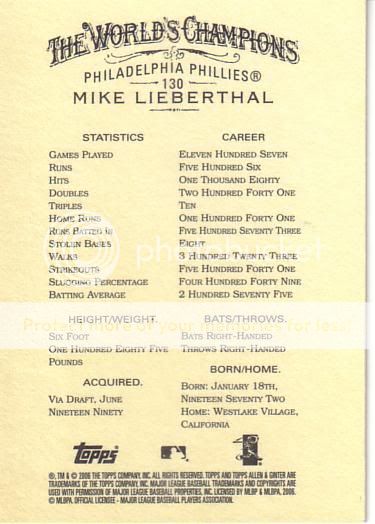
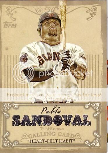
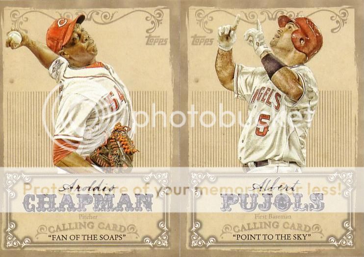
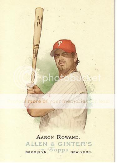
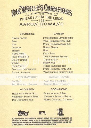
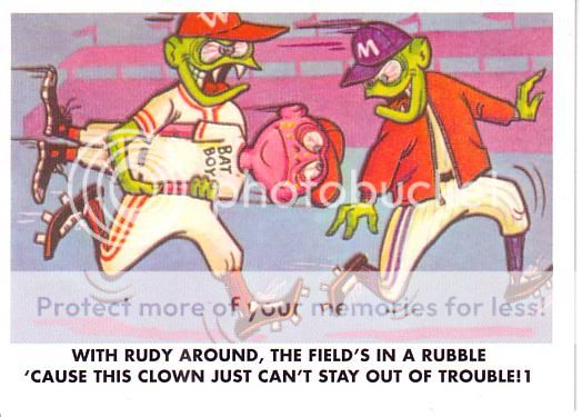
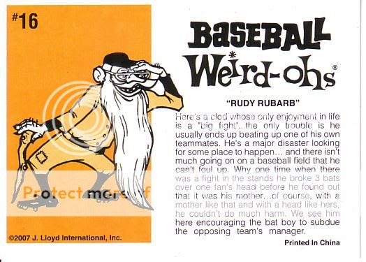
Yes, those are two different scans because I'm a dork.

Unless there are some real cards to unlock, I just don't understand why people would be buying these codes up.  I honestly think you'd be better of buying lottery tickets. 

Even for a decent guesser/analyst, I believe the chances of getting 57 is somewhere in the 1 in a few quadrillion range.  I will be floored if anyone wins it. 


Really, I told you all this just to make it seem that much more amazing when I bring home the cash.  My 8 codes and I are going to rock this.

Monday, February 18, 2013

A Fortnight of 2013 Topps: Day 12


That's damn near die cut insert perfection, right there. I love that they chromed up these cards.  Topps loves to put themes on their sets these days (Diamond, Golden, Chase), and I think this is the best "cheesy" insert name they've come up with. 


Sunday, February 17, 2013

A Fortnight of 2013 Topps: Day 11

Quoth the Night Owl, "MINIIIIIIIIIIIS!"


This is a really well done insert set that just shouldn't exist.


The fronts are great, the backs are great, but they just shouldn't exist.  This is a classic case of Topps going to the well one too many times.  The Lineage '75 minis were nice but the backs and cardstock were terrible.  Last year's '87 minis solved those problems. 

This year's minis, while technically sound, just don't do it for me.  The '72 design is bizarre (in a good way) and cool, but I don't think it works for a mini.  The team names are too busy to make smaller.  The card backs are hard enough to read on regular cards.  Make them a little smaller and you just about need a magnifying glass to avoid a headache. 

Two of the team names make me laugh, too.  By being small, the Reds looks like the "PEDS" and the Rockies looks like the "ROOKIES".  These are like the cardboard versions of Freudian slips.

I don't rate this as a bad insert, and I certainly understand the marketing behind it, but they just don't quite blow my skirt up.

Saturday, February 16, 2013

A Fortnight of 2013 Topps: Day 10


I don't have too much criticism for these cards.  The Calling Card inserts are good, but not great.  I think it would be tough to come up with something better without changing a bunch of the design elements. 

One nitpicky thing to change would be to take the "Heart-Felt Habit" line and remove it from the front.  I think it would declutter the nameplate a little.  Let the card speak for itself, then leave the back to explain it.


The Pujols card looks really nice.

2006 Topps Allen & Ginter #127


Who gets into the HOF first, Clemens, Bonds or Pedro?


Friday, February 15, 2013

A Fortnight of 2013 Topps: Day 9

Inevitably, every Topps set will have a futures/phenoms/rookies related insert.  I'm fine with that.  At least they got rid of the pointless duo cards.

This year's offering, Chasing the Dream, looks like this:


I like the oversized team logo background, but the name on the left side is horrendous.  It's really hard to read.  While I get that they wanted a "name in the lights" style, it just doesn't do it for me.  I tried my hand at a simplifying redesign:


It's not my best work, but it doesn't hurt my eyes to look at it.

As for the rest of the cards I pulled:


Some good talent there.  Except for that Trout guy.  He's garbage. Couldn't even beat Cabrera in MVP voting despite having a better season.  Just weak.

Mad Lib...so close...

Just six more words to go...please comment...I promise it might be worth it...

18. Verb (-ed)
20. Verb (-ing)
21. Noun
25. Verb (-ing)
28. Verb (-s)
29. Funny sounding word

DONE...result coming soon!

Thursday, February 14, 2013

A Fortnight of 2013 Topps: Day 8

...just when I think Topps has done something really great (Chasing History inserts), they go and blow it.


No, I'm not repeating my post from yesterday...these are the retail foil parallels of the Chasing History insert.  They serve absolutely no purpose.  Topps should have gone "either/or" with choice of stock, not "both".  It's tough enough to put together a nice insert set, but now there are two versions of the same one.  Sure, it's sort of like base chrome and refractors, but the foil just doesn't change the card that much.


Strangely, I ended up with two regular Big Hurts and two foil Big Hurts. 

Mad Lib...still need help.

Does my blog really have so few readers that I can't get 30 one-word comments?  

I promise you guys this will have a semi-funny outcome.  Just leave a comment with a word we still need:

12. Verb (-ed)
13. Terrible baseball player
14. Obscure baseball player
15. Day of the week
16. Recent card product
17. Year
18. Verb (-ed)
19. animal
20. Verb (-ing)
21. Noun
22. Star baseball player
23. Baseball play (ie. hitting a home run)
24. Person associated with baseball
25. Verb (-ing)
26. Body part
27. Adjective
28. Verb (-s)
29. Funny sounding word
30. Size adjective

2006 Topps Allen & Ginter #126


Beltran strikes me as a guy who is good but is never quite as good as you think he should be.

Wednesday, February 13, 2013

A Fortnight of 2013 Topps: Day 7

I still need some help with the Mad Lib.  Go here. If you've already submitted a word, feel free to submit another.  I also think we missed the "store name" so I think we need one of those.


Now, back to 2013 Topps:

Now that we've met the parallels, let's introduce ourselves to some inserts.  We'll start with the Chasing History inserts:


You may remember that I took many of the inserts last year and redesigned them. With this one, there is no need.  I think Topps nailed it on the head with these cards.  They employed a common Upper Deck design method of filling a relic placeholder with a team logo.  UD would have foiled it over, though, but Topps smartly kept the colors.  I like the generic colored background on the left side of the cards, especially with the use of team colors. 

Many folks have voiced some disdain for having both horizontal and vertical cards in the same insert set.  While I would have preferred Topps go with vertical for S1 and horizontal for S2, that would have left Topps Update in a quandary.  All in all, I like both orientations.


Ok, so one thing that irks me about these:  On the Santana and Kemp cards, the record descriptions (2,000 SOs and RBI Streak) should be vertically centered in the ribbon.  Oh well...it's a good thing when that's the only flaw.

Weird-Oh Wednesday #16b


It's like the baseball version of Ron Artest.