
Now, back to 2013 Topps:
Now that we've met the parallels, let's introduce ourselves to some inserts. We'll start with the Chasing History inserts:

You may remember that I took many of the inserts last year and redesigned them. With this one, there is no need. I think Topps nailed it on the head with these cards. They employed a common Upper Deck design method of filling a relic placeholder with a team logo. UD would have foiled it over, though, but Topps smartly kept the colors. I like the generic colored background on the left side of the cards, especially with the use of team colors.
Many folks have voiced some disdain for having both horizontal and vertical cards in the same insert set. While I would have preferred Topps go with vertical for S1 and horizontal for S2, that would have left Topps Update in a quandary. All in all, I like both orientations.
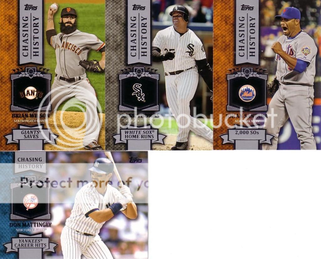
Ok, so one thing that irks me about these: On the Santana and Kemp cards, the record descriptions (2,000 SOs and RBI Streak) should be vertically centered in the ribbon. Oh well...it's a good thing when that's the only flaw.
No comments:
Post a Comment