
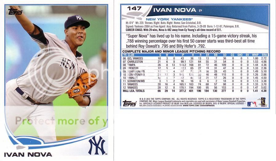
I like the card design, though the white border is terribly dissappointing. How sweet would this be:

If they went wood grain with this design, it would be the best designed Topps set in a very, very long time. I would put together the whole set if it looked like that.
5 comments:
Really? That's interesting. I take great pains to stay away from any card with wood paneling.
Which is odd since all cards are essentially cardboard "wood".
Funny how tastes differ. I myself can't get enough chrome. But not just chrome with no background - I like Chrome gloss over a normal picture.
And because people are on opposite spectrums - card companies produce 20 sets a year which are more often than not very mediocre.
Interesting take on that. I'm not sure if I like it, but it looks pretty neat.
I don't understand the fascination with wood paneling. I think '87 Topps warped a lot of people.
(Get it? "Wood"? "Warped"?
OK I'll go away now).
I wasn't collecting in 87, but I've managed to acquire (and not by choice mind you) a ton of 87 Topps. One thing that I've noticed is the inconsistency in the shading of the wood. Which, being a BBC Snob, drives me absolutely crazy.
For what it's worth, 2012 would have been the year to do wood paneled cards. 1962, 1987, 2012, would have been a nice progression/anniversary.
I loved the 87 set and think your redesign looks pretty cool.
Post a Comment