
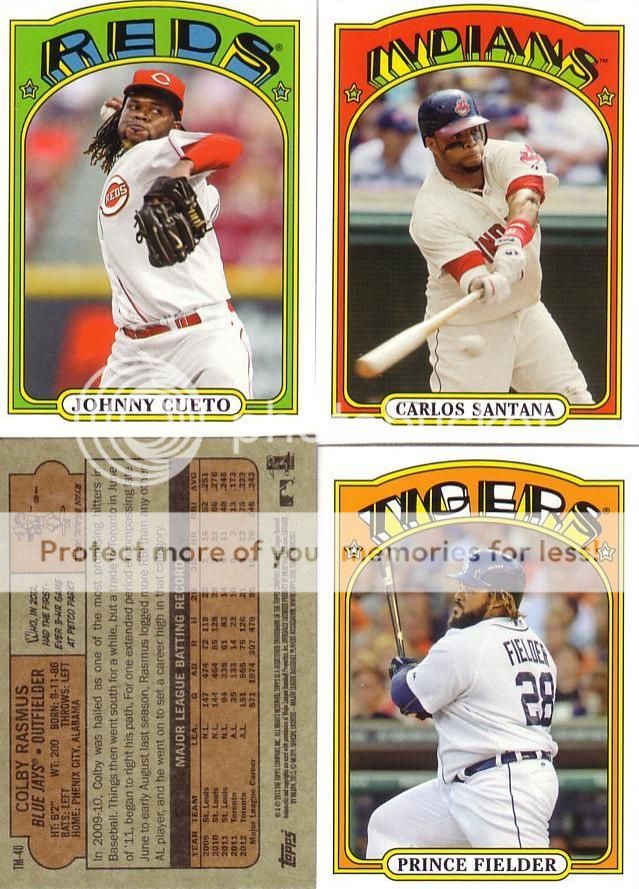
This is a really well done insert set that just shouldn't exist.

The fronts are great, the backs are great, but they just shouldn't exist. This is a classic case of Topps going to the well one too many times. The Lineage '75 minis were nice but the backs and cardstock were terrible. Last year's '87 minis solved those problems.
This year's minis, while technically sound, just don't do it for me. The '72 design is bizarre (in a good way) and cool, but I don't think it works for a mini. The team names are too busy to make smaller. The card backs are hard enough to read on regular cards. Make them a little smaller and you just about need a magnifying glass to avoid a headache.
Two of the team names make me laugh, too. By being small, the Reds looks like the "PEDS" and the Rockies looks like the "ROOKIES". These are like the cardboard versions of Freudian slips.
I don't rate this as a bad insert, and I certainly understand the marketing behind it, but they just don't quite blow my skirt up.
3 comments:
totally agree with the overkill of the vintage minis. never even noticed the PEDS and ROOKIES before...classy.
"This is a really well-done insert set that just shouldn't exist."
Can't describe it any better.
Knowing Topps a salute to 1995 Topps in mini's will happen soon...
Post a Comment