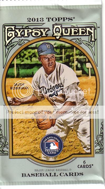
Since I declared yesterday that I'm not buying any more cards until Allen & Ginter comes out, I figured my next post should show the product that came out just prior to that declaration.
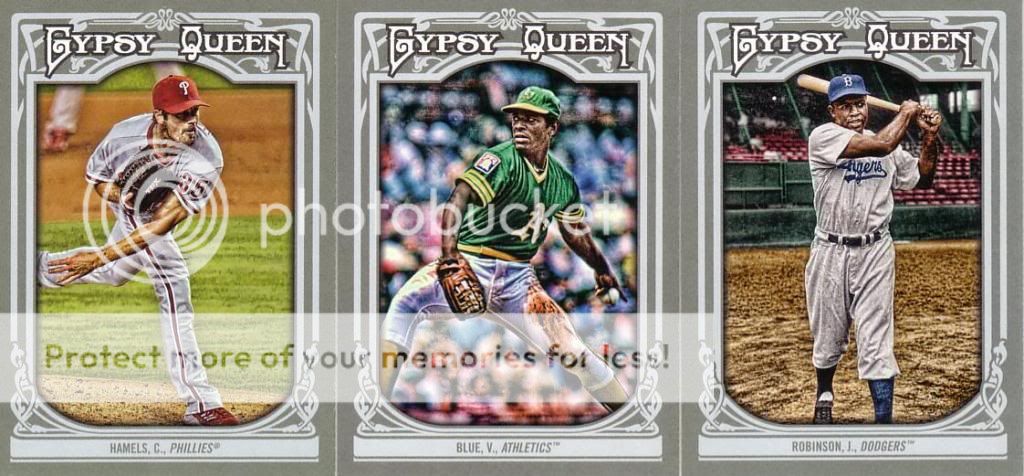
I don't even know what to say. It's not horrible. It's just...not not horrible.
I love that the SPs are inserted backwards in the packs. Makes my life way easier. They're also apparently White Sox.
Why have the SPs dispersed throughout the base set? If you're going 300+50 SPs, stick them at the end so regular collectors can get the 300 and feel some sense of completion.
The minis aren't the same color? That's odd. Oh well, they look better than the base cards. Wainwright is a short print...not that you'd know from the card #.
These look really nice when scanned because the detailing and GQ words look black. In person, they're silver foil and don't look nearly as good. Black on white would have been nice.
The Dealing Aces and Collisions inserts are fantastic. The Sliding Stars cards are a little annoying because the border is so overwhelming. However, it would have been a better design for the base set than what Topps went with. I don't understand why you would take a set with great colorful inserts and completely wash the life out of the base set.


No comments:
Post a Comment