Guy: "what do you want?"
Me: "ummm, to PARTAY!!!, duh."
Guy: "oh you're here for the Lineage party"
Me: "Hells yeah beeyotch"
Guy: "yeah, that was yesterday."
Me: "oh"
...
Ah, late again. Now that you've seen what Lineage is, I want to show you what it should be. I finished second in the 2nd Annual NASA Langley King of the Beach Volleyball tournament, so I took my winnings and grabbed two rack packs and a blaster of Lineage.
 |
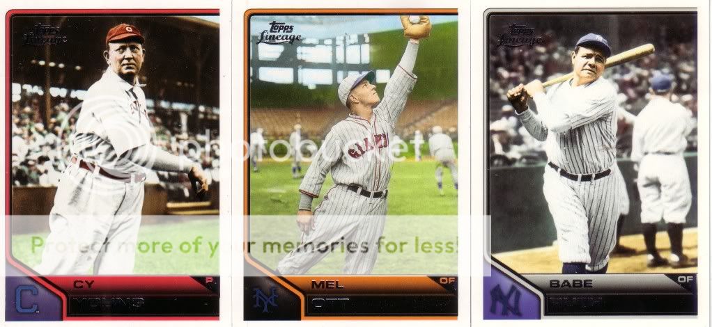
| Holy Mauer Mantle Number Seven Bat Across The Balls In Both Hands, Batman! |
 |
| All four of these came in the two rack packs... |
My expert opinion on this base design: It sucked, until I saw the new 2012 Topps design, which is the new suck.
 |
| Wait, old guys that are SSSSSP variations?!?!?! |
I posted these three because Topps failed to match the team logo with a background that even remotely makes the logos look good.
Dear Topps, if you call it Lineage, perhaps you should be true to the, oh, I don't know, Lineage. Why does Ichiro have an old school rookie trophy? Put the trophy that corresponds to the yearthat the player was an all-rookie. Since we're showing the Ichiro cards...put ICHIRO in the big letters, not the tiny-ass ones. Woohoo, I got two Ichiro Bigassblankspots. In all seriousness, though, Ichiro is a stud. Look at that second card. He's rounding second and I'm pretty sure the ball hasn't even gotten to the second-baseman yet. That's speedy.
 |
| Ok, very nice. I'm a fan. |
 |
| oooooh, so close. |
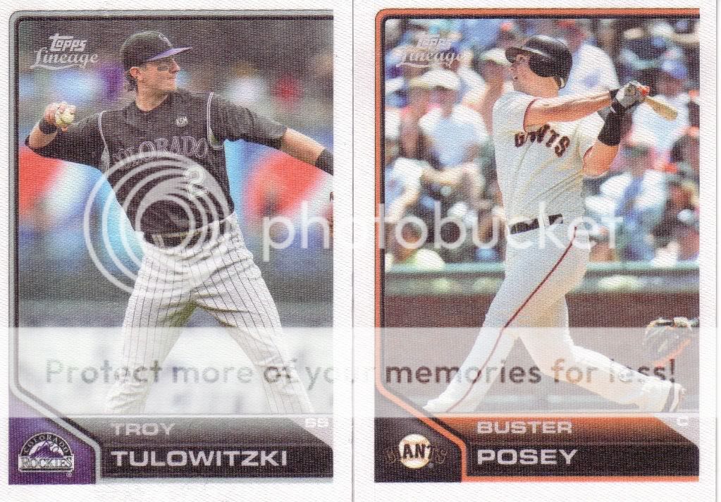
Cloth stickers...a great idea, but not executed how they should have been. This is what they should look like:
Get rid of the borders and name and all and just let the picture be a picture.
 |
| Ahh, almostfractors. |
Well, at least they've gotten rid of the diamo...
oh. dammit. "Topps...now mommy and daddy aren't rich, so pick one and move on. AHT! I said pick one and move on...Topps! I'm counting to 3...1....2...drop it!...drop it!...3...that's it, we're going home."
Now, we move on to the worst insert:
Overproduced crap does not an insert make. Dear Topps again, nostalgia does not make a bad decision a good one. This is like flying a Confederate flag in the name of "heritage." Answer me this: why follow the card back so meticulously on these, but put no effort into the '75 mini backs???
One small change makes these cards bearable:
 |
| The yellow on the original is terrible. |
Of course, if you want to go the extreme route: I like my idea better (although I like all my ideas better. I think that's why they're my ideas):
And now we get to the part where Topps was within a hair of redeeming the product:
 |
| Ever get that feeling like you forgot to do something? |
What the @#&! Topps? And, of course, my suggestion:
See Topps, it's okay to be nostalgic, and in some cases, cheesy. But at least if you commit to an idea, follow through on it. This set is soo freaking lazy.
That was one hell of a party.
Everything is for trade, except for the 4 PC cards at the top.


6 comments:
I'd be willingnto trade for the 75 minis. I might actually try to complete that set.
The Whitey almostfractor would be awesome please. I have a package heading your way soon for our last trade so if you can start a new "Benny" pile that woul be way cool.
I love what you did w/ the rookie card. and did every blaster have an Austin Jackson relic??? I got one, You got one and I think I saw one over at A cardboard problem.
I'd be up for some trades with you for any of the inserts, including the 75 topps minis.
I've probably got a decent # of D. wright cards I could look for - let me know!
I'm sure I'm behind but where did you see the 2012 design?
@lifetimetopps
The '75s are taken, as is the Whitey Ford shiny. Everything else is available.
Post a Comment