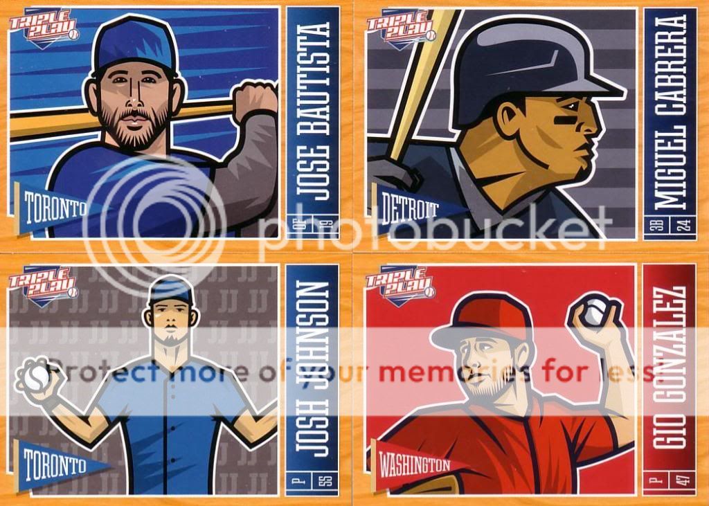
In the 2013 offering, I like the base cards a lot better.
The wood grain looks pretty good on this type of card. I will say the three cards on the right-left diagonal (Rizzo, Profar, Cain) are pretty goofy looking. The other six are excellent.
The horizontals are nice, too. I think it actually works well with the name up the side. I'm just glad they rotated the pennant and TP logo. It sorta looks like Josh Johnson is a fan of Jimmy Johns.
I really dig the Verlander. A look at the back:
Though Panini can't use team logos, they can use Matt Wieters:
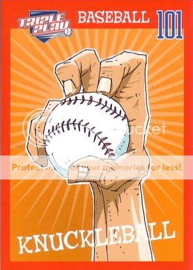
Baseball 101 inserts are back for another year.
I really like that card. There are also All-Stars:
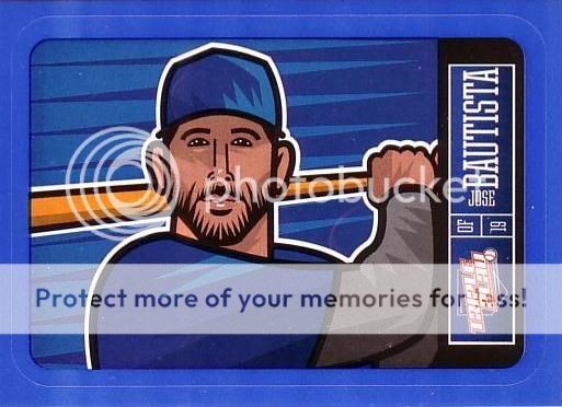
The Stickers are back, in both red
and blue versions.
Unfortunately, I didn't get any tattoos or eye blacks. Oh well. I'm not collecting this set....I have too much left on my 2012 TP want list.


2 comments:
I've got the following 2012 cards for you :
32,144,162,203,211,229,252,263,and264
Heya, of the 2012 set i have for you: 3 black eye, 6 base, 91, 100, 102, 103, 104, 118, 144, 162, 175, 188, 202, 220, 279. Let me know if you are interested ! The dutch card guy
Post a Comment