

I don't have any perfect relic cards, but we can start with...
The Good:
2009 Absolute Memoribilia Football Star Gazing Patrick Turner #142/250
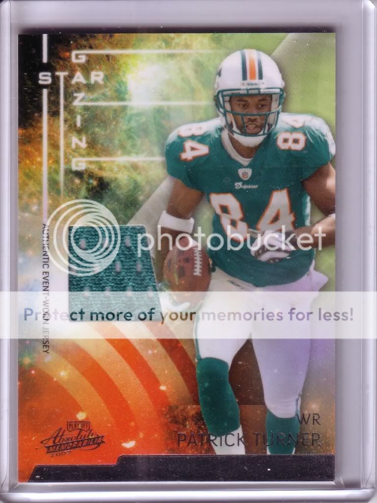
This has many great features. The best, and to me, most important feature: the color of the swatch matches the color worn in the picture. Other good things include a non-square swatch, and serial numbering on the back. I prefer the serial number on the front, but I'll take it. Also, the obligatory authentication clause on the back of the card says the jersey was worn on "5/16 at the 2009 NFL PLAYERS Rookie Premiere". I love when they are specific about where it came from. I also like when there is more to the card back than just the authentication clause.
2008 Upper Deck Sweet Spot Dual Patch Robinson Cano / Brian Roberts #15/25

It's hard to argue a patch card like this. I like the numbering on the front, and it has a player paragraph on the back above the authentication clause. The Cano half is beautiful, nice white with blue patch. The Roberts half, however, just barely misses. I love that it has the black and orange, but unfortunately it's a white jersey, and the picture has a grey jersey.
2007 Press Pass Gridiron Gamers Kevin Kolb #234/275

Nice numbering and a good layout, if only the swatch was red, this card would be incredible.
The Bad:
2008 Sweet Spot Sweet Swatch Travis Hafner (x2)
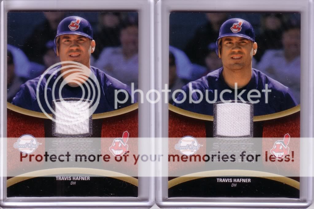
Pretty standard bland white jersey on a card of a guy wearing a nice blue jersey. Kinda wierd that the two swatches are different materials. Makes you wonder which parts they are from.
2008 Sweet Spot Sweet Swatch Dual Dave Winfield / Don Mattingly

Don't get me wrong, it's a great card. So what's wrong with it? Dave Winfield: gray picture/white swatch. Don Mattingly: white picture/gray swatch. Sooo close.
2005 Topps Red Sox World Champions Curt Schilling

This is the first mem card I ever got, so I like it for that reason. I like the idea of a shaped jersey piece, but if that is going to be the case, it should be cut well. The poorly cut window on this looks terrible. And if going through the trouble to cut the B, why not cut two holes and make this card really sweet..
2005 All-Star Classics Midsummer Swatch Edgar Renteria

I thought this card was going to be awesome. A piece of jersey from the midsummer classic (since that seems to be the logical choice for this set) of Renteria as a Red Sox. Unfortunately, the plain white swatch is from a CARDINALS jersey used in some random game. I hate cards with swatches that don't match the color in the picture. Even worse, though, is when the damn team doesn't even match.
2009 Upper Deck Game Materials Brian Bocock

Who is Brian Bocock?...yeah, I didn't know either. Anyway, the jersey matches the picture, and the rest of the card sucks. The fake painted B's look stupid, and why do I want the M? Just a crap card.
The Ugly:
2006 Fleer Fabrics Bobby Abreu

The only thing worse than a plain white swatch, is a grey swatch. But, by far, the worst thing about this card is the lump. The lump is where the swatch bulges out of the back because the card wasn't made thick enough to house it. Ugh.
2010 Topps Commemorative Patch Dizzy Dean

I'm on the fence about manufactured patches in the first place, but this one is made even worse by the bland gray background it's pasted on...blah
And now, we have one the most awful mem cards I've ever seen.
2008-09 Upper Deck NBA MVP Game Night Souvenirs Brian Cook

Where do I start...how a bout here: 5.8 ppg, 0.7 apg, 2.7 rpg, 0.3 bpg, 0.3 spg, 14.1 mpg in 349 career games. So why does he get a mem card?!?!?!?! Ok, so I know what you are thinking: "Is that a terrible player in an Orlando Magic jersey on a card with a YELLOW swatch? I didn't know the Magic wore yellow...". My response: The card says it's a Lakers jersey, duh. You've got to be kidding. Who lets this crap go out the door.
So I'm still in search of the perfect mem card: Decent player, Jersey matches the picture in a color other than white or gray, serial numbered on the front, the team matches, the back of the card has player info and an authentication cluse that says when the jersey was used, and the swatch cut not in a square (even if just barely rounded like the Sweet Spot cards).
3 comments:
Great post. Really well thought out and I agree with mostly every point. I'm always a little bummed when my Yankee swatch is gray...I'd rather have a juicy pinstripe.
I HATE when the jersey is from a different team. I have a Tino card where he is pictured with the Cardinals, and the swatch is from the Yankees. Drives me nuts.
I also don't love inconsistency. For the 2011 Topps 60 Relic Robinson Cano, I have seen THREE different possible jersey colors...I have the navy blue (spring training), and on eBay I have seen red (I assume all-star weekend) and white home jersey. Honestly!
I tend to like the Schilling, because as you say it's die cut, and integrated into a nice place on the card. I hate it when relics are made just because you want to make relic cards. This usually means a big blank spot around the jersey, or (similar to the Turner card) jerseys that are just put right in the middle of the card. However - your points on the color matching the jersey makes this a good card (a big white spot in the middle of a card isn't attractive).
And I too don't like when the jerseys and pictures (or worse, teams) don't match. There have to be enough quality pictures of any of these players to use one of the same color jersey. Or, you know you have a red jersey, so assign your photographers to take more photos of that player at games where the red jersey is worn.
Regarding the Hafners, maybe one is the jersey, the other pants? Or maybe his underwear got stuck in the deal! Ew.
And last - about "worthless" players getting relics (and autos) - I don't mind if (nearly) every player had an autograph and/or relic at some time. You never know when someone's going to hit it big (such as with a World Series victory or random feat such as a no-hitter or hitting for the cycle). And some people might want a team set in relic form (I've been hoping some of the lesser starting lineup from the early '90s Braves team would eventually get relics or autos). But then it kind of sucks when I pull Mr. Nobodyson, third string catcher playing on a AA farm team for the Royals for the third year in a row.
That Cano/Roberts patch card is nice (and I'm a certified, bonafied Yankee hater). I don't like the relic cards that feature one team's jersey and another team's name. I also like the jersey to match the picture. A Michael Young white swatch shouldn't go with a picture of him wearing the red jersey. That's laze designing by the manufacturers.
Post a Comment