
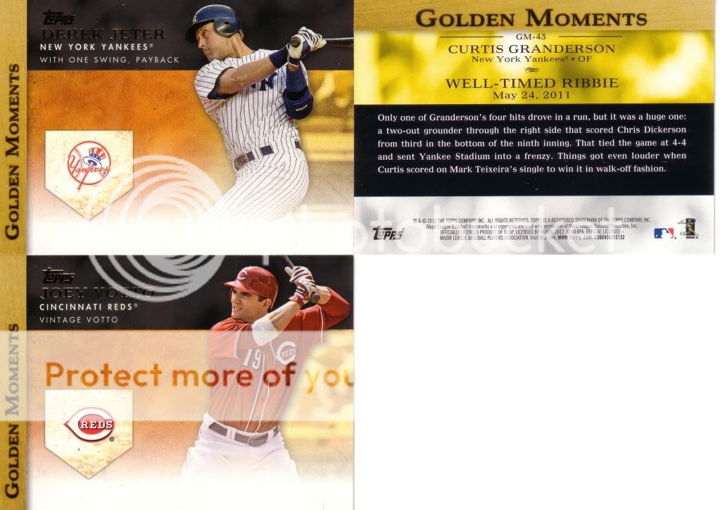
I figured I would lead with the picture this time. Let me highlight all of the things wrong with this card design:

I decided to do a quick mockup of an improved Golden Moments card:

Some of you may be asking where the auto would go. It wouldn't. You don't have to have this be an auto set. I prefer the "moments" sets to be "moments" sets and the auto sets to be auto sets.
As far as the back of the cards...I'm not a big fan of them using "Granderson" first, then all of a sudden switching to "Curtis" at the end. Also, it's pronounced "ribbie", but still spelled RBI. You're not cool because you said ribbie.
That's half a fortnight down, folks.
4 comments:
i'm a 2012 topps "liker" - but i gotta say that i hate that freakin' fade more than anything... it doesn't look good at all! in no way!
Wow, it looks so much better with your improvements!
I like yours better!
You're hired! Wait, I don't work for Topps. Sorry.
Post a Comment