

In the 2013 offering, I like the base cards a lot better.

The wood grain looks pretty good on this type of card. I will say the three cards on the right-left diagonal (Rizzo, Profar, Cain) are pretty goofy looking. The other six are excellent.
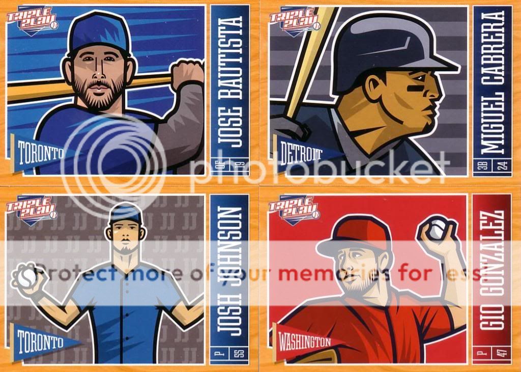
The horizontals are nice, too. I think it actually works well with the name up the side. I'm just glad they rotated the pennant and TP logo. It sorta looks like Josh Johnson is a fan of Jimmy Johns.

I really dig the Verlander. A look at the back:

Though Panini can't use team logos, they can use Matt Wieters:

Baseball 101 inserts are back for another year.
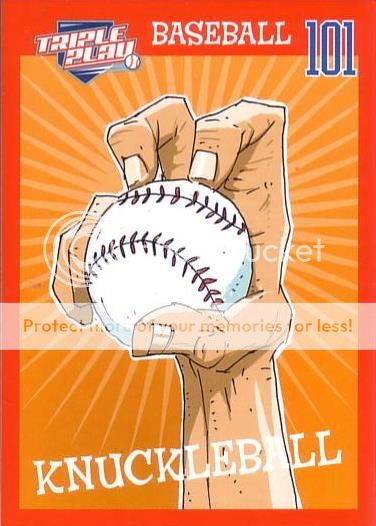
I really like that card. There are also All-Stars:

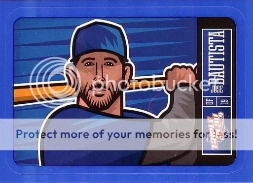
The Stickers are back, in both red

and blue versions.
Unfortunately, I didn't get any tattoos or eye blacks. Oh well. I'm not collecting this set....I have too much left on my 2012 TP want list.
I've got the following 2012 cards for you :
ReplyDelete32,144,162,203,211,229,252,263,and264
Heya, of the 2012 set i have for you: 3 black eye, 6 base, 91, 100, 102, 103, 104, 118, 144, 162, 175, 188, 202, 220, 279. Let me know if you are interested ! The dutch card guy
ReplyDelete